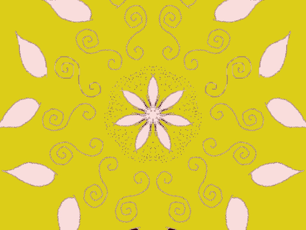
This is a lovely rangoli design 🌼
Here’s some focused feedback based on your style and past works:
What works beautifully
- The yellow background gives a festive, energetic base and really highlights the soft baby-pink petals.
- The central six-petal flower is well-balanced and acts as a calm focal point.
- The spiral motifs around the center add nice movement and rhythm—very traditional yet playful.
- The dot detailing around the center flower adds texture and depth without overcrowding.
Suggestions to enhance it further
- You could add a slightly darker outline (soft brown or maroon) to the pink petals to increase contrast against the yellow.
- Try a gentle gradient in the center flower (light pink to peach) if you’re doing this in Speedy Painter or MS Paint.
- The outer leaf shapes could look even richer with a second tone (light green or pale orange veins).
- A thin circular border enclosing the whole design would give it a more finished, mandala-like feel.
Overall
This rangoli feels bright, elegant, and festive, perfect for a nature or celebration theme. It shows your growing confidence with symmetry and spacing—very consistent with your recent floral designs 🌸
If you want, I can suggest a next variation of this design (same layout, different color palette or theme).
Leave a Reply