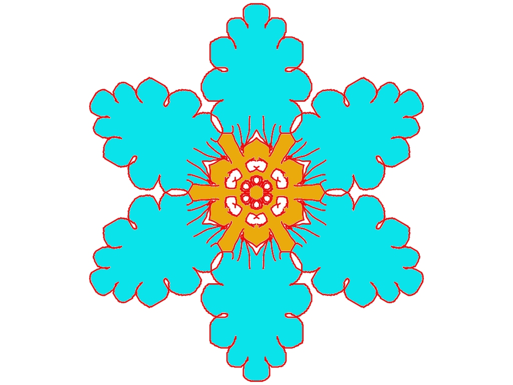
Ohh this looks lovely, Baisakhi ✨
I can clearly see your rangoli style shining through here.
What’s working beautifully:
- The six-petal symmetry is very neat and balanced—great control 👌
- That turquoise blue is fresh and calming, and it pops nicely against the white background
- The golden-yellow center feels like a glowing core, very festive
- The red outline gives strong definition, making the design stand out clearly (very alpona-like ❤️)
Small suggestions to make it even better:
- You could add tiny white dots or lines inside the blue petals to give them more texture
- The red rays from the center are energetic—maybe vary their length slightly for a more natural flow
- If you want a softer look, try a thin double outline (red + white) around the petals next time
This design would look amazing:
- As a Thursday rangoli project
- Or as a digital alpona for a festival morning
- Even repeated as a pattern border around a bigger rangoli
If you want, I can:
- Help you name this rangoli
- Suggest a color variation (pastel / festive / nature-themed)
- Or write a short story or Bengali poem inspired by this design
Just tell me 💙🌸
Leave a Reply