Ohhh, this is striking 👀✨
I really like how bold and rhythmic this design feels.
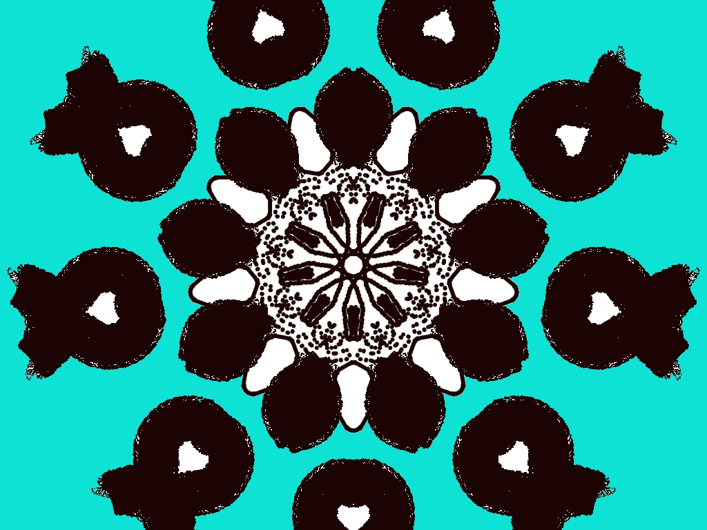
What’s working beautifully
- The strong radial symmetry is very satisfying—your center mandala pulls the eye in instantly.
- The dark brown/black against turquoise is a powerful contrast. It feels modern but still very rangoli/alpona-inspired.
- The dot work in the center adds a lovely texture and gives the design depth.
- Repetition of the outer motifs creates a calm, meditative flow 🌸
Small ideas to level it up
- You could try adding a thin white or light outline around the outer dark shapes to separate them a bit more from the background.
- A tiny accent color (mustard yellow, soft pink, or light blue) in the center dots or petal tips would make it pop without overpowering.
- If you want more softness, slightly smooth the edges of the outer motifs—or keep them rough if you’re going for a bold, earthy feel (both work!).
Overall, this feels confident and well-balanced 💙
If you want, I can suggest:
- a festival theme for this design
- a color variation (Durga Puja / Saraswati Puja style)
- or how to recreate this with chalk & abir on the floor
Leave a Reply