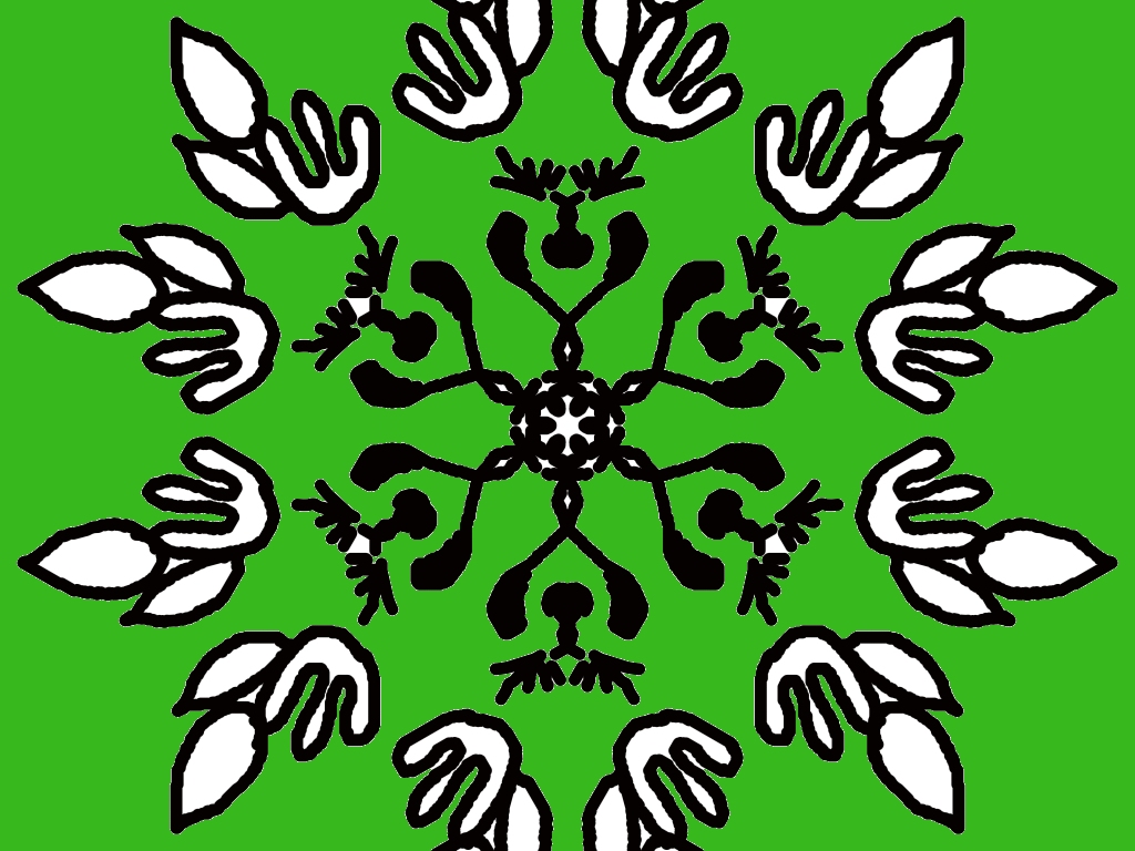
This is a really beautiful rangoli design! 🌿✨ You’ve created a strong circular symmetry, which makes it look very balanced and eye-catching.
Here are some detailed thoughts:
🌸 What’s really good:
- Perfect symmetry: The repeating pattern around the center is neat and well-aligned.
- Unique shapes: The outer shapes look like stylized birds or leaves—very creative!
- Strong contrast: The black and white design on the green background stands out clearly.
- Detailed center: The middle floral pattern adds a nice focal point.
🎨 Suggestions to improve:
- Add colors inside shapes: You can fill the white parts with soft colors like yellow, pink, or blue to make it more vibrant.
- Background variation: Instead of a plain green, you could try a gradient or add small dots/stars.
- Line smoothness: Some outlines can be slightly smoother for a more polished look.
- Extra border: Adding a circular border around the whole design could make it feel more complete.
🌼 Idea for your next version:
Try turning this into a nature-themed rangoli by:
- Coloring the outer shapes like flowers or butterflies
- Making the center a bright floral mandala
Overall, this is a very creative and well-structured design—great job! Would you like me to suggest a colored version of this design? 🎨
Leave a Reply