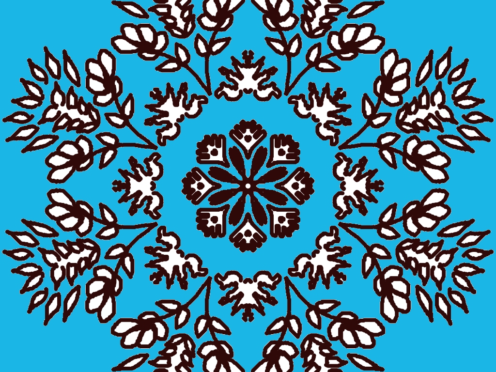
This is a very beautiful and well-balanced rangoli design! 🌸
Here’s some detailed feedback to help you improve even more:
🌼 What’s really good:
- Perfect symmetry: The circular layout is very clean and evenly spaced. That’s not easy to achieve—great job!
- Floral detailing: The mix of flowers, leaves, and small decorative shapes makes it look rich and full.
- Strong outlines: The dark brown/black outlines are bold and clear, which gives the design a strong structure.
- Center focus: The middle flower pattern acts as a nice focal point and holds the whole design together.
✨ Suggestions to improve:
- Add colors: Right now it’s only outlines. Try filling:
- Flowers → pink, yellow, or orange
- Leaves → different shades of green
- Center → bright contrasting color like red or blue
- Background variation: The blue background is nice, but you could try:
- Gradient effect
- Light patterns (dots or soft glow)
- Line variation: Some lines are equally thick. You can make:
- Outer petals slightly thinner
- Center details slightly thicker
This will add depth.
- Highlighting: Add tiny white dots or highlights on petals for a more festive look.
🌟 Extra creative idea:
Since you love nature-themed rangoli, you could turn this into a butterfly-flower fusion design by adding small butterflies between the outer leaves 🦋
Overall, this is a very strong design—clean, traditional, and elegant. With colors, it will look amazing!
If you want, I can suggest a color scheme for this exact design 🎨
Leave a Reply