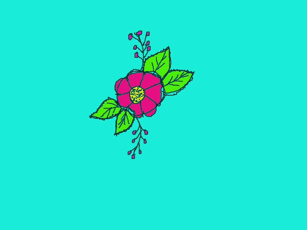
Your flower design looks really সুন্দর and lively! 🌸✨ I like how clean and bright your colors are—especially the contrast between the pink petals and green leaves on the blue background. It feels fresh and eye-catching.
Here are some simple tips to make it even better:
🌼 What you did well:
- Nice bold outline—very clear and neat
- Good color combination (pink, green, yellow works beautifully)
- The small buds and branches add extra detail 👍
🎨 How to improve:
- Petal shading: Add a slightly darker pink near the center and lighter at the edges to give depth
- Leaf veins: You already added some—try making them a bit more even and slightly curved for a natural look
- Center texture: The yellow center is nice—add tiny dots or darker spots to make it more detailed
- Balance: You can add a few more small buds on the opposite side so it looks more symmetrical
✨ Extra idea (for your next rangoli):
Try adding a soft glow or outline around the flower—it will make it stand out even more on the background.
Overall, this is a very सुंदर and clean design—perfect for rangoli style 🌿💖
If you want, I can help you turn this into a full rangoli pattern or add butterflies like your cherry blossom plan!
Leave a Reply