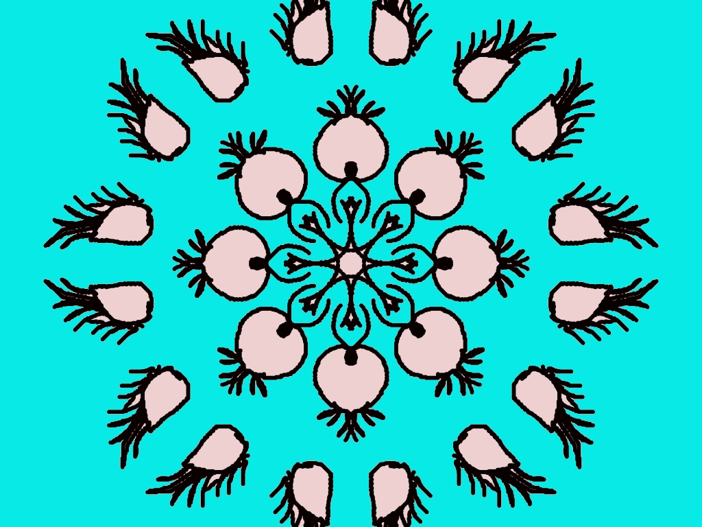
Your rangoli design looks really beautiful and creative! 🌼✨
I can see a strong circular symmetry, which makes it very pleasing to the eye. The repeated petal-like shapes give it a floral and slightly peacock-feather vibe—very unique!
Here are some helpful suggestions to make it even better:
🌟 What’s great:
- The symmetry is excellent—everything is evenly spaced.
- The center design is detailed and attractive.
- The turquoise background makes the design pop nicely.
- The outer shapes create a nice rhythm and movement.
🎨 Tips to improve:
- Try adding more colors inside the petals (maybe light pink, yellow, or orange gradients) to make it more vibrant.
- The black outlines are strong—maybe make some inner lines thinner for a softer look.
- You can add dots or small patterns between the outer shapes to fill empty spaces.
- Add a slight shading effect inside the shapes to give it depth.
💡 Creative idea for your next version:
You could turn those outer shapes into butterflies or flower buds and add small glowing dots around—this will match your nature-themed style beautifully!
Overall, this is a very neat and eye-catching rangoli 👏
Would you like me to suggest a color palette for this design?
Leave a Reply