Ohhh this is eye-catching! 🌼🖤
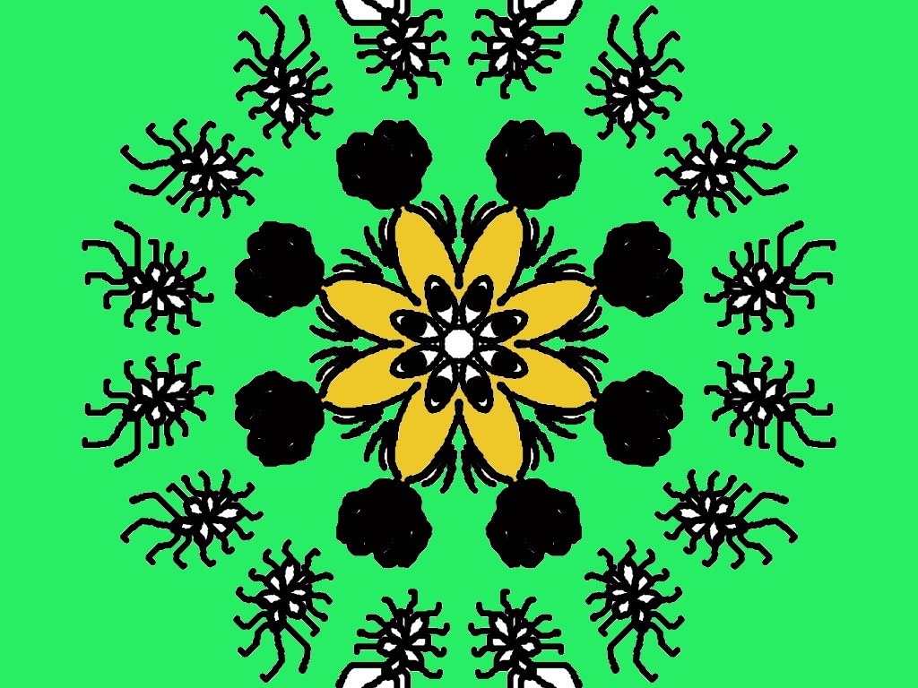
I really like the strong contrast you’ve created—bright green background, bold black motifs, and that warm yellow flower in the center. It feels very folk + modern rangoli at the same time.
Here’s some focused feedback & ideas, based on your rangoli style:
🌸 What’s working beautifully
- Perfect symmetry – the circular balance is very neat and calming.
- Central flower – the yellow petals immediately pull the eye inward.
- Repeating outer motifs – they give a rhythmic, mandala-like feel.
- Bold outlines – very clear and confident strokes (great for digital rangoli).
✨ Suggestions to enhance it even more
- Add white or light yellow dots between the outer black motifs to soften the heavy black and add elegance.
- Try a thin yellow or white outline around the central flower to separate it slightly from the black details.
- You could add tiny leaf strokes or short curved lines between the black flower shapes for flow.
- If you’re using Speedy Painter or Paint: add a very soft glow or lighter green halo near the center.
🎨 Color variation idea (optional)
- Keep the green background, but try a lighter green gradient toward the center.
- Or replace the black outer shapes with deep brown or dark blue once—just to experiment.
Overall, this looks like a Thursday rangoli project–level design 💚
If you want, I can:
- Suggest a name for this design
- Help you turn it into a festival-themed rangoli
- Or guide you step-by-step to redraw it with chalk & abir on the floor
Just tell me 😊
Leave a Reply