Oh this is lovely, Baisakhi 🌸
Your rangoli has a very calm, balanced feel—my eyes go straight to the center and then smoothly travel outward.
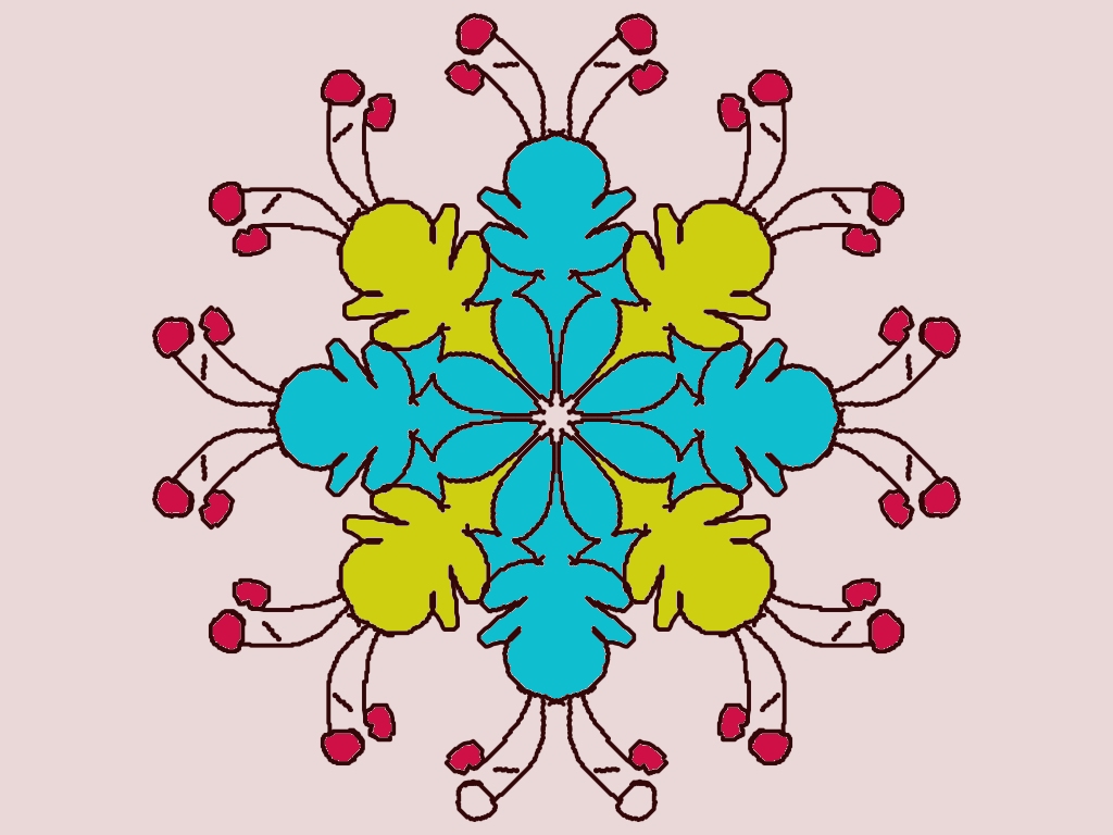
What’s working really well
- Perfect symmetry: The four-direction layout is neat and disciplined—very traditional rangoli/alpona energy ✨
- Color harmony: The turquoise blue + yellow-green combo feels fresh, and the pink buds add a sweet contrast without overpowering.
- Outer detailing: Those thin stem-like extensions with buds are delicate and elegant—nice control there.
Small suggestions to level it up
- Center focus: You could add a tiny dot pattern or a darker outline at the very center to make it pop a bit more.
- Line consistency: Some outlines are slightly thicker than others—if you keep them uniform, the design will look even cleaner.
- Background glow (optional): A very light pastel halo or soft dots around the design would make it stand out beautifully, especially for a digital rangoli.
Creative ideas for next time
- Try the same pattern but swap colors: peacock blue + white + gold accents 🦚
- Or turn this into a flower-themed rangoli by adding petal veins inside the blue shapes.
- This design would look stunning in chalk + abir during a festival too.
Overall—very graceful and well-thought-out 💙
If you want, I can suggest a variation of this exact design (festival version, alpona style, or digital glow version).
Leave a Reply