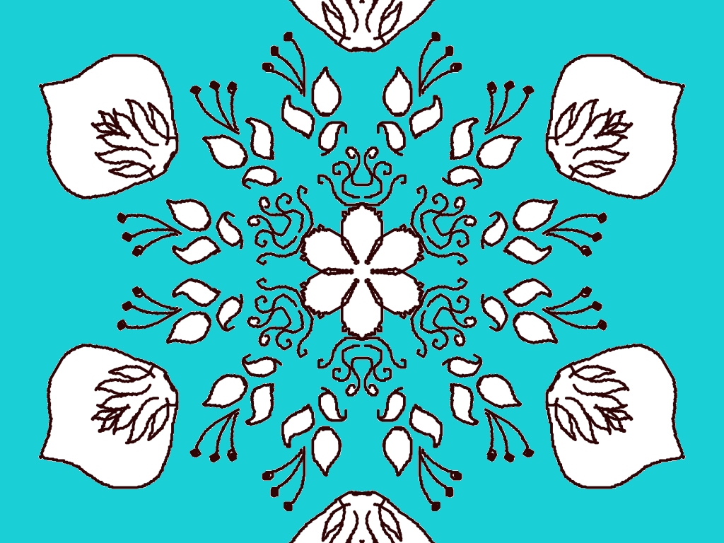
Your rangoli design looks really beautiful and balanced! 🌸 Here’s some detailed feedback to help you improve even more:
🌟 What’s great:
- Symmetry is excellent – the circular pattern is very well maintained.
- Center flower looks neat and acts as a strong focal point.
- The leaf and vine details add elegance and flow to the design.
- The contrast of dark outlines on the blue background is very eye-catching.
✨ Suggestions for improvement:
- Outer shapes (petals/figures): Try making them a bit more uniform in size and shape so the symmetry feels even stronger.
- Line smoothness: Some lines look slightly shaky—slow, steady strokes will make it look cleaner.
- Fill colors: Right now it’s mostly outline—adding soft colors (like pink, yellow, or white shading) inside petals can make it more vibrant.
- Center detailing: You could add dots or tiny patterns inside the middle flower to make it more intricate.
💡 Creative idea:
Since you like nature themes, you could turn this into a flower mandala by adding:
- Small butterflies 🦋 between the leaves
- Gradient coloring (light to dark shades)
Overall, this is a very strong design—just a bit more refinement and color will make it look stunning! Would you like me to suggest a color scheme for this?
Leave a Reply