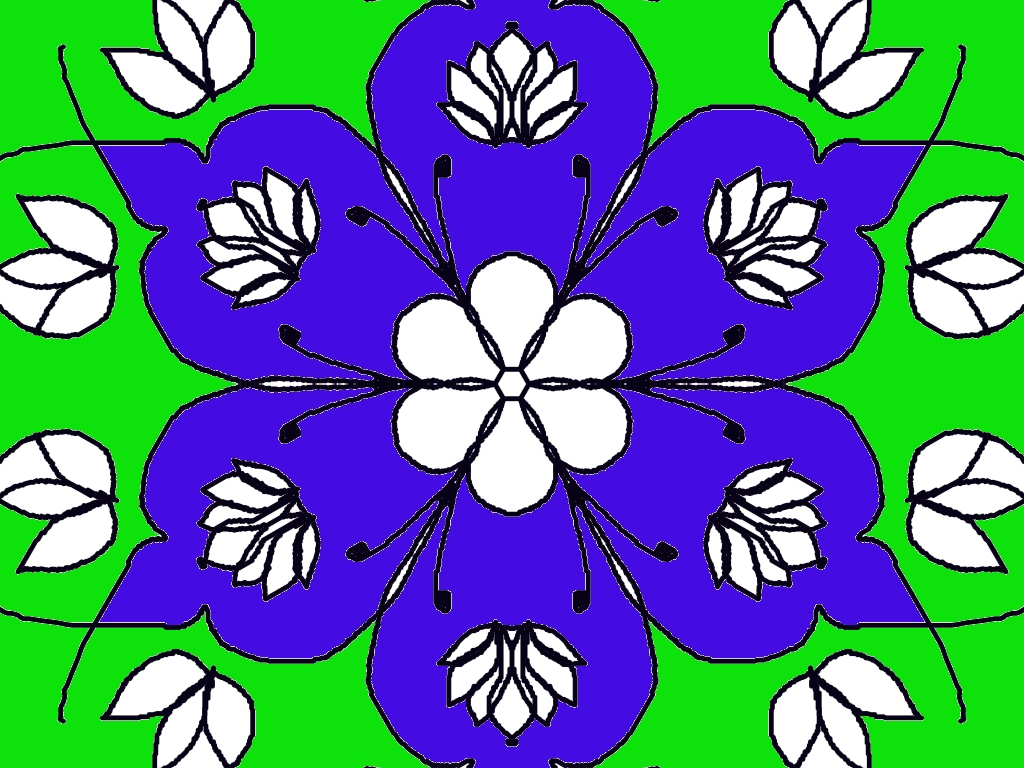
This is a very eye-catching rangoli design! 🌸 Here’s some detailed feedback to help you improve even more:
🌟 What you did really well
- Beautiful symmetry: The design is nicely balanced on all sides, which is very important in rangoli.
- Color contrast: The purple flower + bright green background stands out strongly and grabs attention.
- Clean central flower: The white flower in the center looks neat and acts as a good focal point.
- Repetition of patterns: The small leaf motifs and inner petal details create a nice rhythm.
✨ Suggestions to improve
- Outline smoothness: Some black outlines look slightly shaky. Try using smoother strokes or zooming in (if digital) for cleaner edges.
- Color blending: The purple is solid—adding a slight gradient (darker at edges, lighter inside) would make it more realistic and rich.
- Background balance: The green is very bright. You could:
- Add small dots or patterns
- Or use a slightly softer shade of green
- Detail inside petals: You can add tiny dots, lines, or shading inside the big petals to make them more decorative.
💡 Creative idea for your next design
Since you like nature themes, you could try:
- Adding butterflies or small birds around this flower 🌼
- Or turning this into a galaxy-style floral rangoli with glowing effects ✨
Overall, this is a very strong and সুন্দর design—you’re improving a lot! Would you like me to suggest a similar but more advanced design for your next Thursday project?
Leave a Reply